facebook Displaying Bivariate Data (Scatter Plots) Math Video for Kids - Grades 6-8
1%
Processing, please wait...
It was processed successfully!
Reading Material

Read About Displaying Bivariate Data (Scatter Plots)

Download as PDF   Go Back to Lesson
Displaying Bivariate Data (Scatter Plots)
WHAT IS A SCATTER PLOT?

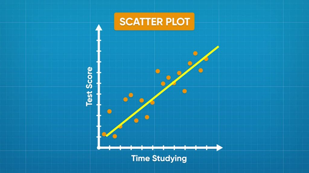
A scatter plot is a graph that shows the relationship between data that has two numeric variables. For example, if you collect data on the relationship between the number of hours a student studies and their score on a test, the data has two numeric variables: time studied and test score. You graph scatter plot values on the coordinate plane.

To better understand displaying bivariate data (scatter plots)…

WHAT IS A SCATTER PLOT?. A scatter plot is a graph that shows the relationship between data that has two numeric variables. For example, if you collect data on the relationship between the number of hours a student studies and their score on a test, the data has two numeric variables: time studied and test score. You graph scatter plot values on the coordinate plane. To better understand displaying bivariate data (scatter plots)…

LET’S BREAK IT DOWN!

Make a scatter plot to show ice cream purchases and daily temperatures.
Make a scatter plot to show ice cream purchases and daily temperatures.

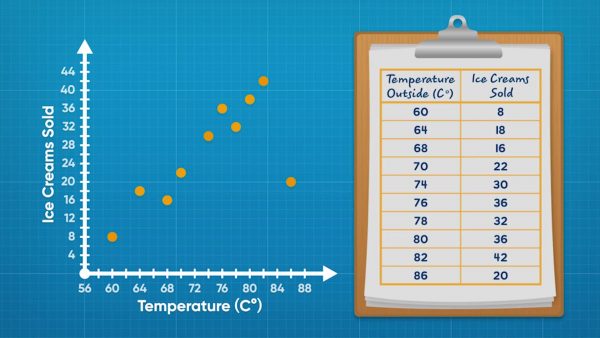
Adesina collected data about ice cream fundraisers. Each piece of data gives the temperature that day and the amount of ice cream sold. This kind of data is called bivariate data because it has 2 variables. Line plots can only show 1 variable. Scatter plots are a tool you can use to display bivariate data. You can make coordinate pairs using the data. For example, one day it was 60 degrees Fahrenheit and 8 ice creams were sold. You can then plot (60, 8) on a coordinate plane. Repeat for all data points and you have a scatter plot. It is called a scatter plot because the data looks scattered. Now you try: One day was 75 degrees Fahrenheit. They sold 49 ice creams. What coordinate pair would you use to represent this data point on the scatter plot?

Make a scatter plot to show ice cream purchases and daily temperatures. Adesina collected data about ice cream fundraisers. Each piece of data gives the temperature that day and the amount of ice cream sold. This kind of data is called bivariate data because it has 2 variables. Line plots can only show 1 variable. Scatter plots are a tool you can use to display bivariate data. You can make coordinate pairs using the data. For example, one day it was 60 degrees Fahrenheit and 8 ice creams were sold. You can then plot (60, 8) on a coordinate plane. Repeat for all data points and you have a scatter plot. It is called a scatter plot because the data looks scattered. Now you try: One day was 75 degrees Fahrenheit. They sold 49 ice creams. What coordinate pair would you use to represent this data point on the scatter plot?

Identify the relationship between ice cream purchases and daily temperatures.
Identify the relationship between ice cream purchases and daily temperatures.

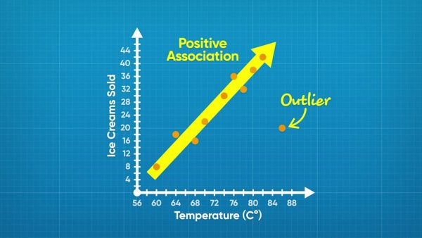
While the ice cream data is scattered, it does show a trend. In general, the higher the temperature, the greater the number of ice creams sold. This is called a positive association because the values are increasing as you move right. One point, (86, 20), does not follow the trend. This point is an outlier. Now you try: A scatter plot shows the relationship between time spent running and distance ran. In general, as time increases, distance also increases. What kind of association is there between the variables?

Identify the relationship between ice cream purchases and daily temperatures. While the ice cream data is scattered, it does show a trend. In general, the higher the temperature, the greater the number of ice creams sold. This is called a positive association because the values are increasing as you move right. One point, (86, 20), does not follow the trend. This point is an outlier. Now you try: A scatter plot shows the relationship between time spent running and distance ran. In general, as time increases, distance also increases. What kind of association is there between the variables?

Identify relationships with negative or no association.
Identify relationships with negative or no association.

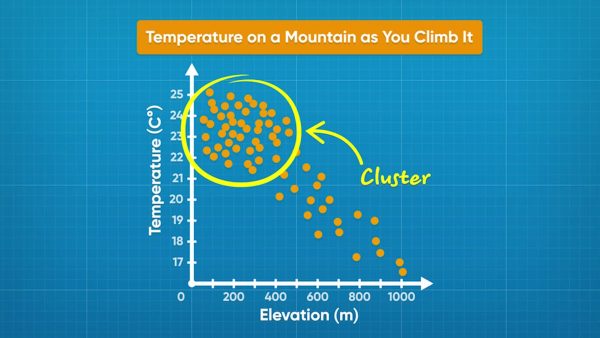
A scatter plot shows temperature and elevation data. Each data point shows the temperature read at a given elevation. Elevation is on the x-axis and temperature is on the y-axis. As the graph goes from left to right, the dots trend downward. As elevation increases, temperature decreases. This plot shows a negative association. Another scatter plot shows the relationship between adult age and adult height. The points are spread out and do not show any trend. This relationship shows no association. Now you try: Draw a scatter plot that shows no association. Draw another scatter plot that shows a negative association.

Identify relationships with negative or no association. A scatter plot shows temperature and elevation data. Each data point shows the temperature read at a given elevation. Elevation is on the x-axis and temperature is on the y-axis. As the graph goes from left to right, the dots trend downward. As elevation increases, temperature decreases. This plot shows a negative association. Another scatter plot shows the relationship between adult age and adult height. The points are spread out and do not show any trend. This relationship shows no association. Now you try: Draw a scatter plot that shows no association. Draw another scatter plot that shows a negative association.

Find the relationship between study time and test scores.
Find the relationship between study time and test scores.

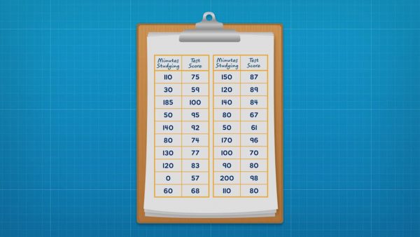
Amari surveyed her class to find out how long they studied for a test and what score they got on the test. She made a coordinate plane that could show test scores from 57% to 100% on the y-axis and study time from 0 to 200 minutes on the x-axis. Then she plotted each data point as (study time, test score). Once all of the data is plotted, she looks for a trend. In general, as study time increases, test scores also increased. There is a positive association between the variables. The trend can be highlighted by drawing a trend line. A trend line is drawn through the middle of the data. A trend line also makes outliers more obvious. The data includes an outlier: one student only studied for 15 minutes and received a score of 95%. Now you try: A company did a survey recording the ages of cyclists and how far they bike each week. How could you label the graph and the axes to represent the data?

Find the relationship between study time and test scores. Amari surveyed her class to find out how long they studied for a test and what score they got on the test. She made a coordinate plane that could show test scores from 57% to 100% on the y-axis and study time from 0 to 200 minutes on the x-axis. Then she plotted each data point as (study time, test score). Once all of the data is plotted, she looks for a trend. In general, as study time increases, test scores also increased. There is a positive association between the variables. The trend can be highlighted by drawing a trend line. A trend line is drawn through the middle of the data. A trend line also makes outliers more obvious. The data includes an outlier: one student only studied for 15 minutes and received a score of 95%. Now you try: A company did a survey recording the ages of cyclists and how far they bike each week. How could you label the graph and the axes to represent the data?

Find the relationship between dog weights and food.
Find the relationship between dog weights and food.

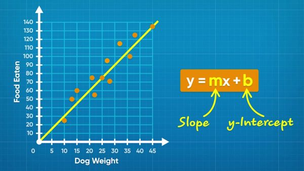
Emily collects data on how much dogs weigh and how much they eat. She plots the data on a scatter plot with "Weight (kg)" on the x-axis and "Food per Day (g)" on the y-axis. She plots each set of data points as coordinate pairs (weight, food). Once all points are plotted, you can see that as dogs get heavier, they eat more food! You can draw a trend line approximately through the middle of the data. You can find the equation of the trend line. Any line can be written in the form y = mx + b, where m is the slope and b is the y-intercept. You could pick two points on the line, such as (25, 75) and (45, 135), to calculate the slope and intercept. The slope is (135 – 75) ÷ (45 – 25) = 3. The y-intercept of Emily's line is 0. So the equation of the line is y = 3x + 0, or y = 3x. Now you try: A trend line passes through the points (0, 15) and (4, 12). What is the equation of the trend line?

Find the relationship between dog weights and food. Emily collects data on how much dogs weigh and how much they eat. She plots the data on a scatter plot with "Weight (kg)" on the x-axis and "Food per Day (g)" on the y-axis. She plots each set of data points as coordinate pairs (weight, food). Once all points are plotted, you can see that as dogs get heavier, they eat more food! You can draw a trend line approximately through the middle of the data. You can find the equation of the trend line. Any line can be written in the form y = mx + b, where m is the slope and b is the y-intercept. You could pick two points on the line, such as (25, 75) and (45, 135), to calculate the slope and intercept. The slope is (135 – 75) ÷ (45 – 25) = 3. The y-intercept of Emily's line is 0. So the equation of the line is y = 3x + 0, or y = 3x. Now you try: A trend line passes through the points (0, 15) and (4, 12). What is the equation of the trend line?

DISPLAYING BIVARIATE DATA (SCATTER PLOTS) VOCABULARY

Line plot
A data display that shows single-variable data as points along a number line.
Data
Information gathered.
Bivariate data
Data that has two variables.
Coordinate plane
A two-dimensional plane made up of two number lines that intersect at 0.
Coordinate pair
When you plot a point on a coordinate plane, you identify the location of the point on the x-axis (horizontal) and y-axis (vertical). A coordinate pair shows the location in the form (x-coordinate, y-coordinate).
Scatter plot
A data display that shows bivariate data on a coordinate plane.
A trend in bivariate data where when the value of the x-coordinate increases, the value of the y-coordinate also increases.
A trend in bivariate data where when the value of the x-coordinate increases, the value of the y-coordinate decreases.
A value that does not follow the general trend of a set of data.
Bivariate data is clustered if the data are very close together when plotted.

DISPLAYING BIVARIATE DATA (SCATTER PLOTS) DISCUSSION QUESTIONS

What are some examples of bivariate data you could collect?

It should be data where the information collected has two numeric values, such as height versus weight.

How can you plot bivariate data on a scatter plot?

Pick one variable to be on the x-axis. The other variable goes on the y-axis. Write a coordinate pair for each piece of data. Then plot each data point.

What does bivariate data look like when it shows a positive association?

In general, as the x-value increases, the y-value also increases.

What does bivariate data look like when it shows a negative association?

In general, as the x-value increases, the y-value decreases.

How can you draw a trend line through scatter plot data? How can you find an equation for that line?

I can draw a line that goes approximately through the middle of the data. To find the equation, I can use two points on the line to calculate the slope. I can also use a point and the slope, or look at the graph, to find the y-intercept. The equation is in the form y = mx + b.
X
Success
We’ve sent you an email with instructions how to reset your password.
Ok
x
Choose Your Free Trial Period
3 Days

3 days to access to all of our teaching resources for free.

Continue to Lessons
30 Days

Get 30 days free by inviting other teachers to try it too.

Share with Teachers
Get 30 Days Free
By inviting 4 other teachers to try it too.
4 required

*only school emails accepted.

Skip, I will use a 3 day free trial

Thank You!

Enjoy your free 30 days trial

We use cookies to make your experience with this site better. By using this site you agree to our use of cookies. Click "Decline" to delete and block any non-essential cookies for this site on this specific property, device, and browser. Please read our privacy policy for more information on the cookies we use.Learn More

We use cookies to improve your experience. By using this site, you agree to our use of cookies. Click "Decline" to block non-essential cookies. See our privacy policy for details.Learn More